1.子图绘制

使用matplotlib, seaborn绘制子图时主要注意plt.subplot(a, b, c)这个方法使用,其中

  • a, 代表行数

  • b, 代表列数

  • c, 代表绘制在第几个

    这3个参数经常写作abc这种形式。本文来自于 tutorial-python-subplots

seaborn.countplot()绘制函数可以在 seaborn.countplot学习,其它也类似。

1. 绘制1x1子图

1
2
3
4
5
6
7
8
9
10
11
12
13
14
15
16
17
18
19
20
21
22
23
24
25
26
27
28
29
30
31
32
33
34
#
import pandas as pd
import matplotlib.pyplot as plt
import seaborn as sns
import numpy as np
from pathlib import Path
np.set_printoptions(threshold=20)

data_dir = Path(r'data')
df = pd.read_csv(data_dir/'heart.csv')
print(df.head(), df.shape)

## 1.绘制1x2的子图
fig = plt.figure(figsize=(10, 4))

#subplot 1
plt.subplot(121)#1行2列中第一个子图
plt.title('heart subplot: 121')
sns.countplot(data=df, x='cp')

#子图2
plt.subplot(122)#1行2列中第一个子图
plt.title('heart subplot: 122')
sns.scatterplot(data=df, x='age', y='chol', hue='sex')
plt.show()
=================================================
age sex cp trestbps chol fbs ... exang oldpeak slope ca thal target
0 63 1 3 145 233 1 ... 0 2.3 0 0 1 1
1 37 1 2 130 250 0 ... 0 3.5 0 0 2 1
2 41 0 1 130 204 0 ... 0 1.4 2 0 2 1
3 56 1 1 120 236 0 ... 0 0.8 2 0 2 1
4 57 0 0 120 354 0 ... 1 0.6 2 0 2 1

[5 rows x 14 columns] (303, 14)

image-20210810232333868

2. 绘制2x1的子图

1
2
3
4
5
6
7
8
9
10
11
12
13
## 2.绘制2x1的子图
fig = plt.figure(figsize=(5, 10), dpi=250)

#subplot 1
plt.subplot(211)#2行1列中第一个子图
plt.title('heart subplot: 211')
sns.countplot(data=df, x='cp')

#子图2
plt.subplot(212)
plt.title('heart subplot: 212')
sns.scatterplot(data=df, x='age', y='chol', hue='sex')
plt.show()

image-20210810232903674

3.绘制2x3子图

1
2
3
4
5
6
7
8
9
10
11
12
13
14
15
16
17
18
19
20
21
22
23
fig = plt.figure(figsize=(14, 12), dpi=250)

plt.subplot(231)
plt.title('heart subplot: 231')
sns.countplot(data=df, x='cp', hue='sex')

plt.subplot(232)
plt.title('heart subplot: 232')
sns.scatterplot(data=df, x='age', y='chol', hue='sex')

plt.subplot(233)
plt.title('heart subplot: 233')
# 折线图 阴影表示y在一个95%的置信范围 实线代表均值
sns.lineplot(data=df, x='age', y='oldpeak')

plt.subplot(234)
plt.title('heart subplot: 234')
sns.boxplot(data=df[['chol', 'trestbps', 'thalach']]) #箱图

plt.subplot(235)
plt.title('heart subplot: 235')
sns.histplot(df.age) #分布直方图
plt.show()

202203261912695

4. 用for循环绘制子图

1
2
3
4
5
6
7
8
9
10
11
12
heart_categorical = ['sex', 'cp', 'ca', 'thal', 'restecg']
a, b, c = 2, 3, 1

fig = plt.figure(figsize=(14, 10), dpi=250)

for i in heart_categorical:
plt.subplot(a, b, c)
plt.title('{}, subplot:{}{}{}'.format(i, a, b, c))
plt.xlabel(i)
sns.countplot(df[i])
c += 1
plt.show()

202203261912696

5.用for循环绘制不同类型子图

1
2
3
4
5
6
7
8
9
10
11
12
13
14
15
16
17
18
19
20
21
22
23
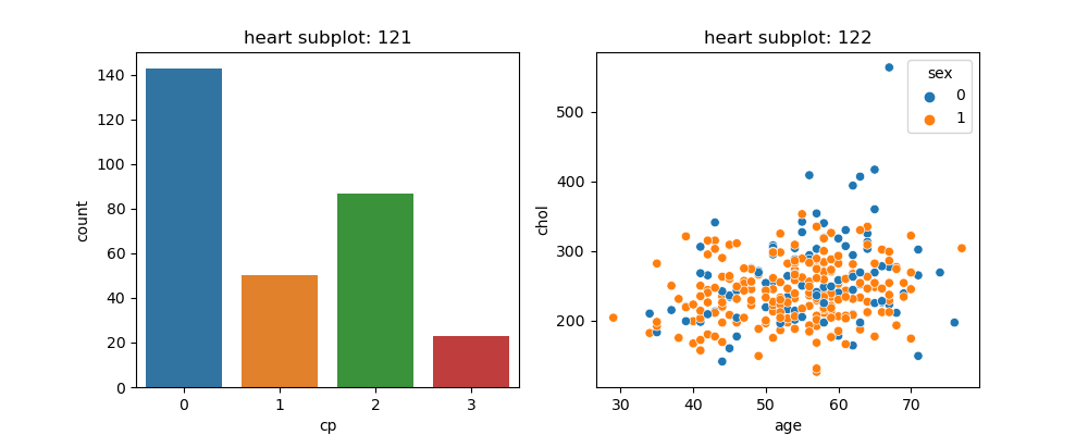
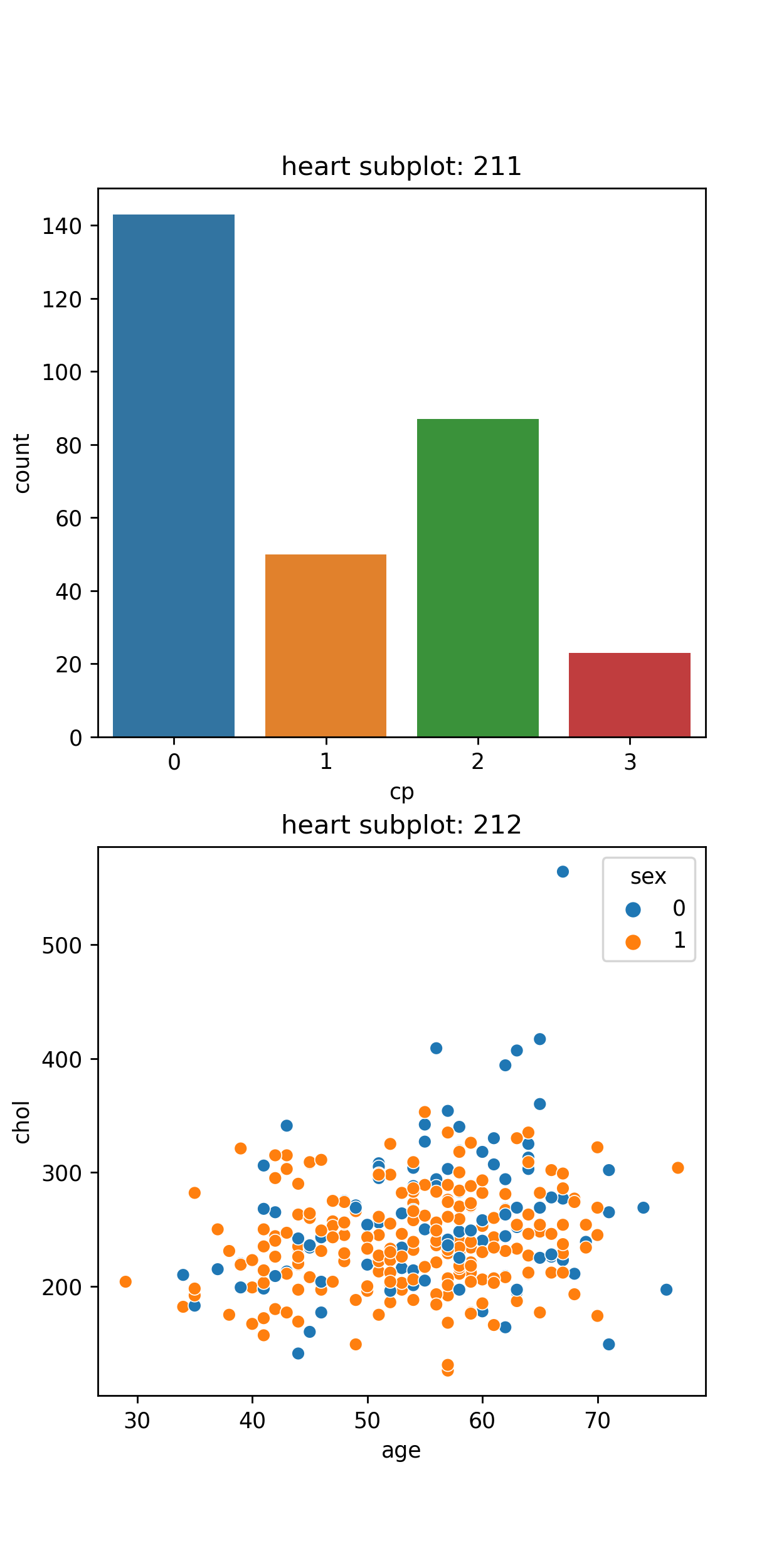
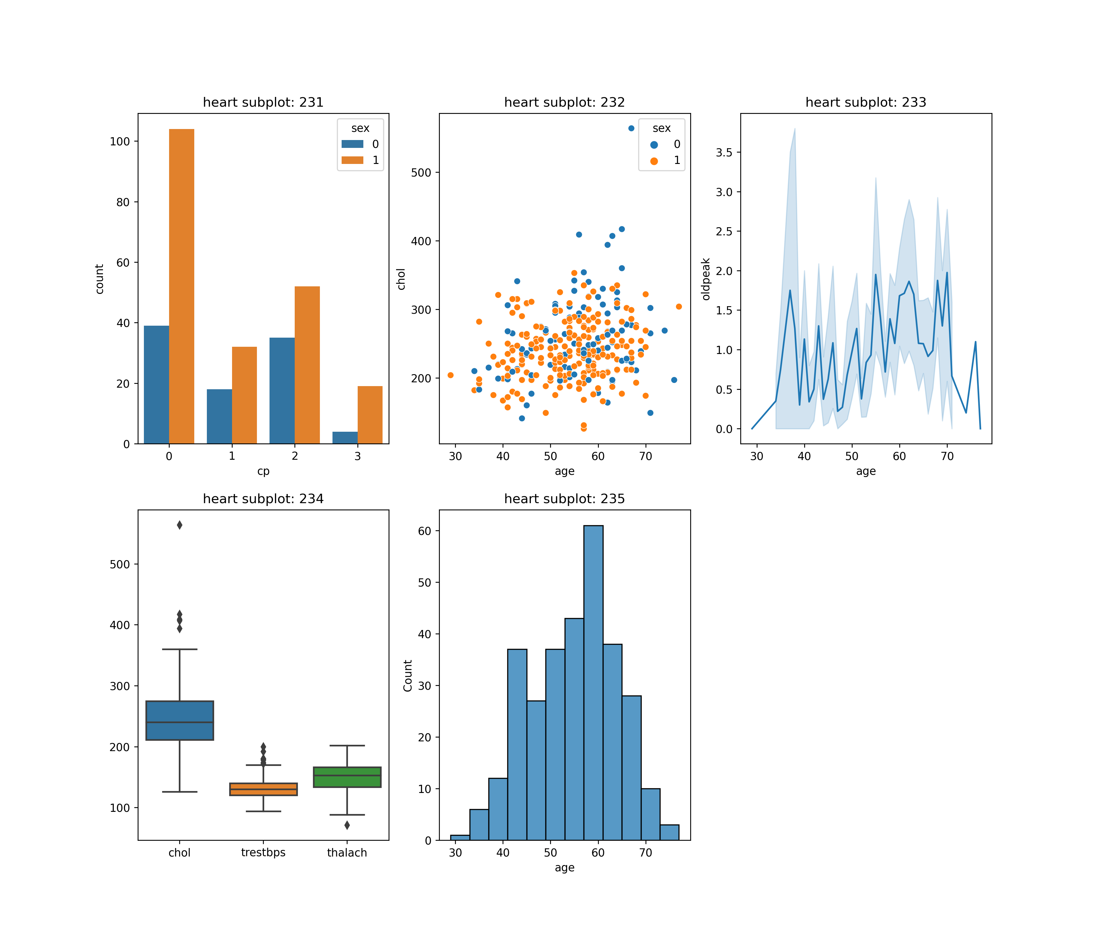
heart_categorical = ['age', 'trestbps', 'thalach', 'oldpeak']
a, b, c = 4, 3, 1

fig = plt.figure(figsize=(14, 22), dpi=250)
for i in heart_categorical:
plt.subplot(a, b, c)
plt.title('{} (dist), subplot:{}{}{}'.format(i, a, b, c))
plt.xlabel(i)
sns.distplot(df[i])
c += 1

plt.subplot(a, b, c)
plt.title('{} (box), subplot:{}{}{}'.format(i, a, b, c))
plt.xlabel(i)
sns.boxplot(x = df[i])
c += 1

plt.subplot(a, b, c)
plt.title('{} (scatter), subplot:{}{}{}'.format(i, a, b, c))
plt.xlabel(i)
sns.scatterplot(data=df, x=i, y='chol', hue='sex')
c += 1
plt.show()

202203261912697

6. 热力图子图

1
2
3
4
5
6
7
8
9
10
11
12
13
14
15
16
17
18
19
20
21
22
23
24
25
26
27
28
29
30
31
32
33
df2 = df[['sex', 'age', 'trestbps', 'chol', 'thalach', 'oldpeak']]

#相关性女性
df_female = df2[df2['sex']==1]
print(df_female.head())
df_female_corr = df_female.drop(['sex'], axis=1).corr()

df_male = df2[df2['sex']==0]
print(df_male.head())
df_male_corr = df_male.drop(['sex'], axis=1).corr()

fig = plt.figure(figsize=(12, 6), dpi=250)
plt.subplot(121)
plt.title('female.corr, subplot: 121')
sns.heatmap(df_female_corr, annot=True, fmt='.2f', square=True, cmap='rainbow')

plt.subplot(122)
plt.title('male.corr, subplot: 122')
sns.heatmap(df_male_corr, annot=True, fmt='.2f', square=True, cmap='rainbow')
plt.show()
===========================================================
sex age trestbps chol thalach oldpeak
0 1 63 145 233 150 2.3
1 1 37 130 250 187 3.5
3 1 56 120 236 178 0.8
5 1 57 140 192 148 0.4
7 1 44 120 263 173 0.0
sex age trestbps chol thalach oldpeak
2 0 41 130 204 172 1.4
4 0 57 120 354 163 0.6
6 0 56 140 294 153 1.3
11 0 48 130 275 139 0.2
14 0 58 150 283 162 1.0

image-20210811001709097

7. pairplot 成对绘制相关性

1
2
sns.pairplot(data=df[['age', 'chol', 'trestbps']])
plt.show()

image-20210811002818192

可以看看这个对pairplot解释:Python可视化 | Seaborn5分钟入门(七)——pairplot.

  • kind:用于控制非对角线上的图的类型,可选"scatter"与`”reg”
  • diag_kind:控制对角线上的图的类型,可选"hist"kde ,其中: 直方图(hist)+内核密度函数(kde)